R Shiny App User Guide –
Visualising Learning Effectiveness for Insights on Northclass Institute
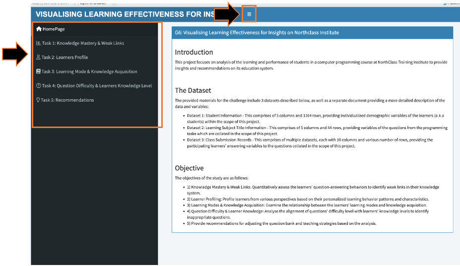
1. Homepage & Sidebar Menu
This is the landing page for the R Shiny App. It contains an overview of the project, including an Introduction to the Scope, the Raw Datasets and the Main Objectives of the project.
1.1.The Sidebar Panel pops up in the default view but can be hidden away or reopened with the button (with 3 lines). Navigation through the Sidebar Panel guides the user through the various components of the App, which is structured into the five key analysis tasks of the project.
2. Task 1: Knowledge Mastery & Weak Links.
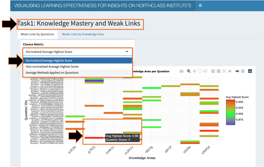
Clicking on Task 1 brings the user to the Data Visualisation for Task 1.
2.1. In this section, there are 2 Tabs at the top allowing users to switch views between analyzing weak links by individual questions or by knowledge areas.
2.2. For the 1st tab, users can observe the heatmap displaying the (1) Knowledge Mastery Metric as the Intensity, (2) Questions in the y-axis, and (3) Knowledge areas in the x-axis. There is only 1 bar in the map for each question, but multiple questions can belong to each knowledge area.
2.2.1. Users may select from 3 different Knowledge Mastery Metrics in the Dropdown Selection List – Normalised Average Highest Score, Non-normalised Average Highest Score and Average No. of Methods Applied on Questions.
2.2.2. Hovering over the heatmap, users can see the precise intensity reading, as well as other details offering more contextual information on each question. Or make use of the various buttons and click-drag to toggle the zoom of the plot.
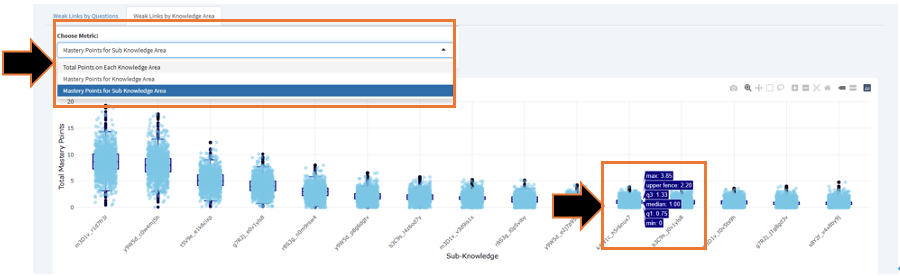
2.3. For the 2nd tab, users can observe the charts for weak links by knowledge area, consisting of 3 charts – 2 box plots comparing the distribution of Mastery Points across knowledge areas and sub knowledge areas respectively, and another heat map similar to the 1st tab. The box plots are arranged from highest to lowest median mastery points from left to right.
2.3.1. Hovering over points in the box plot, users can see the precise Mastery point reading, whereas hovering over the sides of the box plot, users can see other summary statistics for the box plot. Or make use of the various buttons and click-drag to toggle the zoom of the plot.
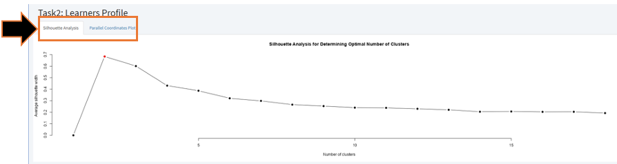
3. Task 2: Learners’ Profile.
Clicking on Task 2 brings the user to the Data Visualisation for Task 2.
3.1. In this section, there are 2 Tabs at the top allowing users to switch views between the Silhouette Analysis or Parallel Coordinates Plot.
3.2. For the 1st tab, users can observe the Silhouette Analysis showing the optimum number of clusters based on the final set of Learning Profile features selected for the project.
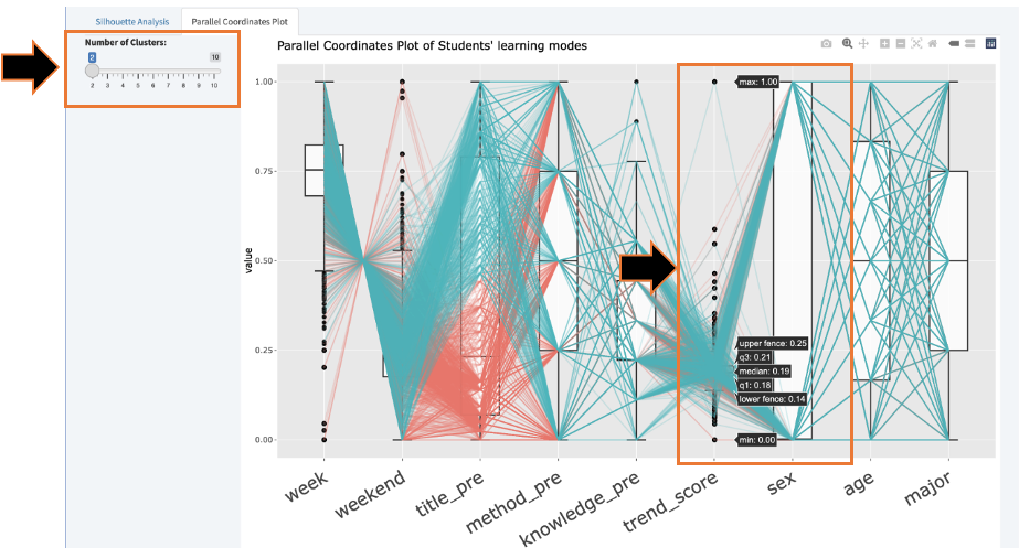
3.3. For the 2nd tab, users can observe the differences between the clusters across selected Learning Profile features in the parallel coordinates plot above and the data table below which lists the distinctive values for each feature for each cluster.
3.3.1. Users may toggle the number of clusters from the slidebar to observe the changes to the parallel coordinates plot and data table.
3.3.2. Hovering over the points in the plot, users can see the precise density reading, whereas hovering over the sides of the box plot, users can see other summary statistics for the box plot. Or make use of the various buttons and click-drag to toggle the zoom of the plot.
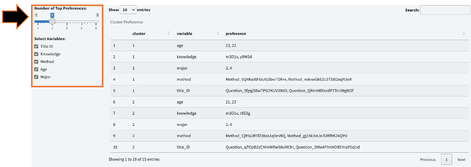
3.3.3. Users may also check and uncheck different variables to filter the view in the data table.
3.3.4. Users may also toggle the number of the preferences in each variables to see the top preferences.
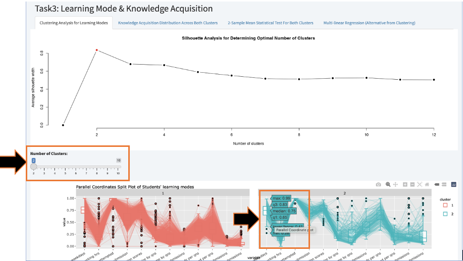
4. Task 3 Learning Modes and Learners Knowledge Acquisition.
Clicking on Task 3 brings the user to the Data Visualisation for Task 3.
4.1. In this section, there are 4 Tabs at the top allowing users to switch views between the Clustering analysis, Knowledge Acquisition Distribution Across Both Clusters, 2-Sample Mean Statistical Test for Both Clusters, and Multi-linear Regression Model.
4.2. For the 1st tab, users can observe the Silhouette Analysis above showing the optimum number of clusters based on the final set of features selected for the project, and the Parallel Coordinates Plot below showing the differences between the clusters across selected features.
4.2.1. Users may toggle the number of clusters from the slidebar to observe the changes to the parallel coordinates plot and data table.
4.2.2. Hovering over the points in the Parallel Coordinates plot, users can see the precise density reading, whereas hovering over the sides of the box plot, users can see other summary statistics for the box plot. Or make use of the various buttons and click-drag to toggle the zoom of the plot.
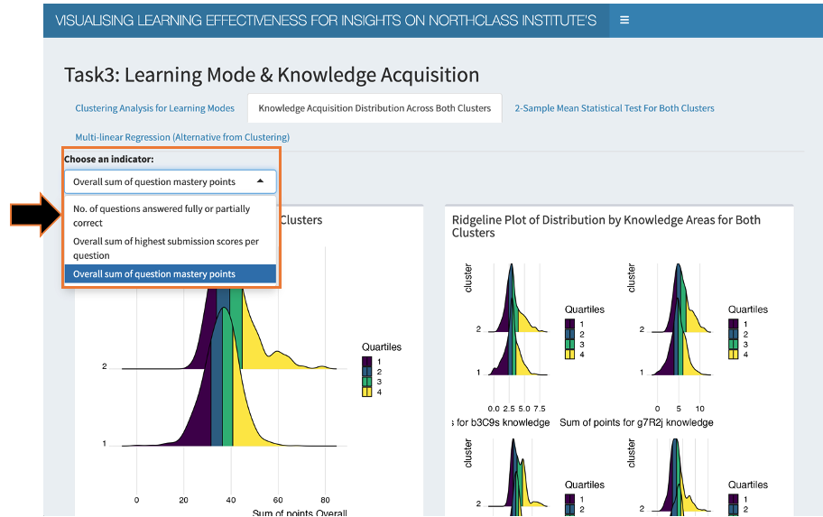
4.3. For the 2nd tab, users can observe the Ridgeplot Distribution Analysis for Knowledge Acquisition metrics with quantiles across the 2 clusters. The left plot shows the overall Knowledge acquisition for both clusters, while the right plot shows the breakdown into the 8 Knowledge areas.
4.3.1. Users may select from 3 different Knowledge Acquistion Metrics in the Dropdown Selection List – No. of Questions Answered Fully or Partially, Overall Sum of Highest Submission Scores per question and Overall Sum of Question Mastery Points.
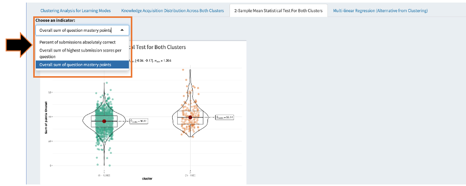
4.4. For the 3rd tab, users can observe the 2-Sample Mean Statistical Test across the 2 clusters, showing (1) the violin plot with (2) the median, as well as the statistical test figures including the (3) coefficient and (4) p-value for 95% level of significance.
4.4.1. Users may select from 3 different Knowledge Acquistion Metrics in the Dropdown Selection List – No. of Questions Answered Fully or Partially, Overall Sum of Highest Submission Scores per question and Overall Sum of Question Mastery Points.
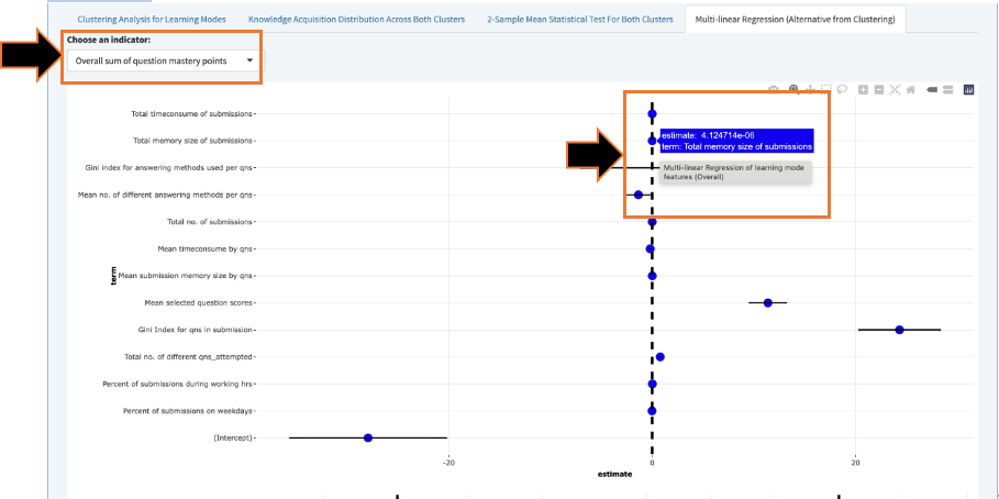
4.5. For the 4th tab, users can observe the Multiple Linear Regression Analysis showing the statistical significance of the linear relationship between the knowledge acquisition dependent variable against the final set of selected learning mode features as independent variables. The plot above shows Linear regression model for the overall knowledge acquisition indicators, while the plots below show the breakdown into the 8 knowledge areas.
4.5.1. Users may select from 2 different Knowledge Acqusition Metrics in the Dropdown Selection List – Overall Sum of Highest Submission Scores per question and Overall Sum of Question Mastery Points.
4.5.2. Hovering over the points in the Multi-linear regression plot, users can see the precise coefficient estimates, or may make use of the various buttons and click-drag to toggle the zoom of the plot.
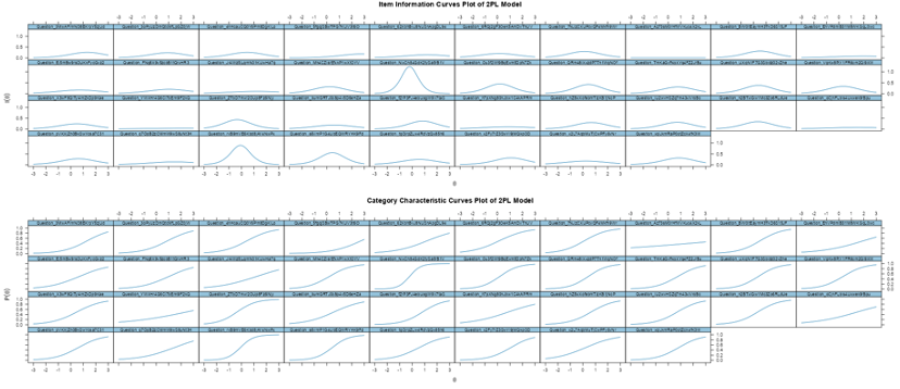
5. Task 4 Question Difficulty and Learners Knowledge Level.
Clicking on Task 4 brings the user to the Data Visualisation for Task 4.
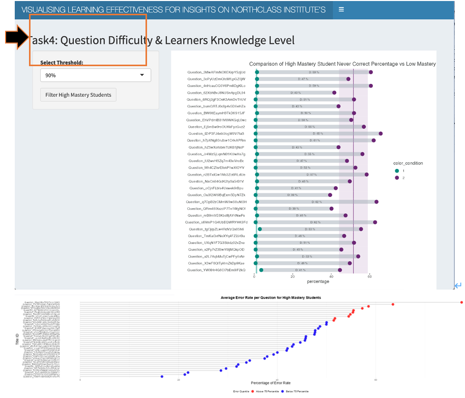
5.1. In this section, users must first select from 2 possible values of 90 and 95% in the Dropdown Selection List for Percentile Threshold in defining High and Low Mastery Students.
5.2. Based on the selection, users can then observe (1) the Dumbbell plot showing the comparison of Percentage of Students that Never got a question correct in the High Mastery Student pool with that of the Low Mastery Student pool, (2) the Lollipop plot showing the Average Error Rate per Question for High Mastery Students, and (3) the Information Characteristic Curves (ICC) showing the questions’ ability to discriminate between High and Low Mastery Students answering performance.
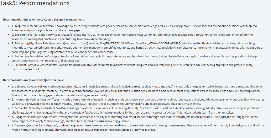
6. Task 5 Recommendations.
Clicking on Task 5 brings the user to the Recommendations as part of Task 5 requirements. It consists of recommendations to enhance the Course Design & Management, as well as Recommendations to improve the Question bank, based on insights from Tasks 1 to 4.